Sorted Group
Designing and evolving the digital experience from My Parcel Delivery to Sorted — a case study in UX, accessibility, and performance-led design
Roles
UX/UI Design and Development
Duration
2014 - 2025
Platforms
Umbraco, VS Code, HubSpot, Gatsby.js, WordPress, Framer
Focus areas
UX Research, Accessibility, Design Systems, Conversion Optimisation
My Parcel Delivery
(Consumer UX)
2014 - 2020
Early front-end and UX design work focused on clarity, conversion, and performance for a parcel comparison site.
The Challenge
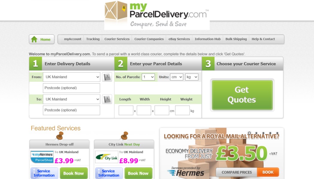
When I joined My Parcel Delivery, the website was visually dated, non-responsive, and struggled to meet the expectations of a growing online audience. The design lacked structure and consistency, making it difficult for users to quickly compare courier options or complete their booking journey. As a result, engagement and conversions were being affected by unclear navigation, limited mobile support, and outdated front-end code.
The challenge was to deliver a full-site redesign that modernised the user experience end-to-end, ensuring consistency, responsiveness, and improved conversion performance across all key pages and journeys.
Key objectives:
Redesign the entire website to create a cohesive, modern, and responsive user experience.
Simplify complex user journeys, improving clarity and accessibility throughout the booking and comparison flows.
Strengthen engagement and conversion through improved structure, hierarchy, and visual design.
The Solution
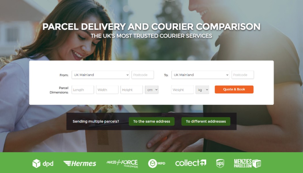
As part of a small in-house digital team, I contributed to the redesign and front-end development of the My Parcel Delivery platform across multiple page types, including the homepage, comparison results, checkout process, and customer support flows. The goal was to modernise the interface and create a more intuitive, consistent, and conversion-focused user experience. I helped implement a flexible, responsive grid system to maintain design consistency across breakpoints and device types, while refreshing the visual language with a simplified colour palette, clearer typography hierarchy, and refined UI components. These improvements provided users with stronger visual cues and reduced friction throughout the parcel booking process.
From a technical perspective, I helped rebuild sections of the front end using lightweight, standards-compliant code (HTML, CSS, and jQuery) to improve load performance and maintainability. Collaboration with the Marketing and Engineering teams was key in aligning design direction with brand and business goals.
Key actions:
Contributed to a full-site UX and UI redesign to improve consistency and usability.
Implemented a responsive grid system and reusable front-end components.
Enhanced accessibility, SEO, and page performance through clean, semantic code.
Collaborated cross-functionally to align design improvements with commercial KPIs.
The Results
The full-site redesign delivered measurable improvements across engagement, usability, and performance. The new responsive layout and optimised interaction design created a faster, more coherent experience that significantly reduced user friction throughout the booking flow. Improved visual clarity and accessibility standards strengthened user trust and extended the platform’s reach across devices.
These collective enhancements contributed to increased conversion rates and stronger customer retention, with more users completing their booking journeys successfully. The site’s improved technical performance also supported SEO gains and operational efficiency.
Key outcomes:
These improvements contributed to My Parcel Delivery achieving profitability for the first time, strengthening its commercial position ahead of its eventual sale in 2020.
Sorted
(Enterprise SaaS UX)
2014 - 2025
Scaling a SaaS platform through data-led UX, accessibility, and design system thinking.
The Challenge
As Sorted evolved into a SaaS delivery experience platform, its digital presence needed to reflect a new enterprise focus. The website had transitioned across multiple platforms, including Umbraco, Gatsby.js, and WordPress, which created inconsistencies in design, performance, and content management. These fragmented systems led to disjointed user journeys and limited the marketing team’s ability to manage and optimise content effectively.
The objective was to unify the experience through a scalable, performance-led design that improved UX consistency, accessibility, and conversion. The redesign needed to streamline information hierarchy, enhance usability, and establish a flexible framework capable of adapting as the platform grew.
Key objectives:
Unify the website across multiple platforms to create a consistent, scalable, and maintainable user experience.
Improve accessibility, performance, and UX flow to better support enterprise-level audiences and lead generation.
Establish a flexible design and content framework that empowers marketing teams while maintaining brand and UX consistency.
The Solution
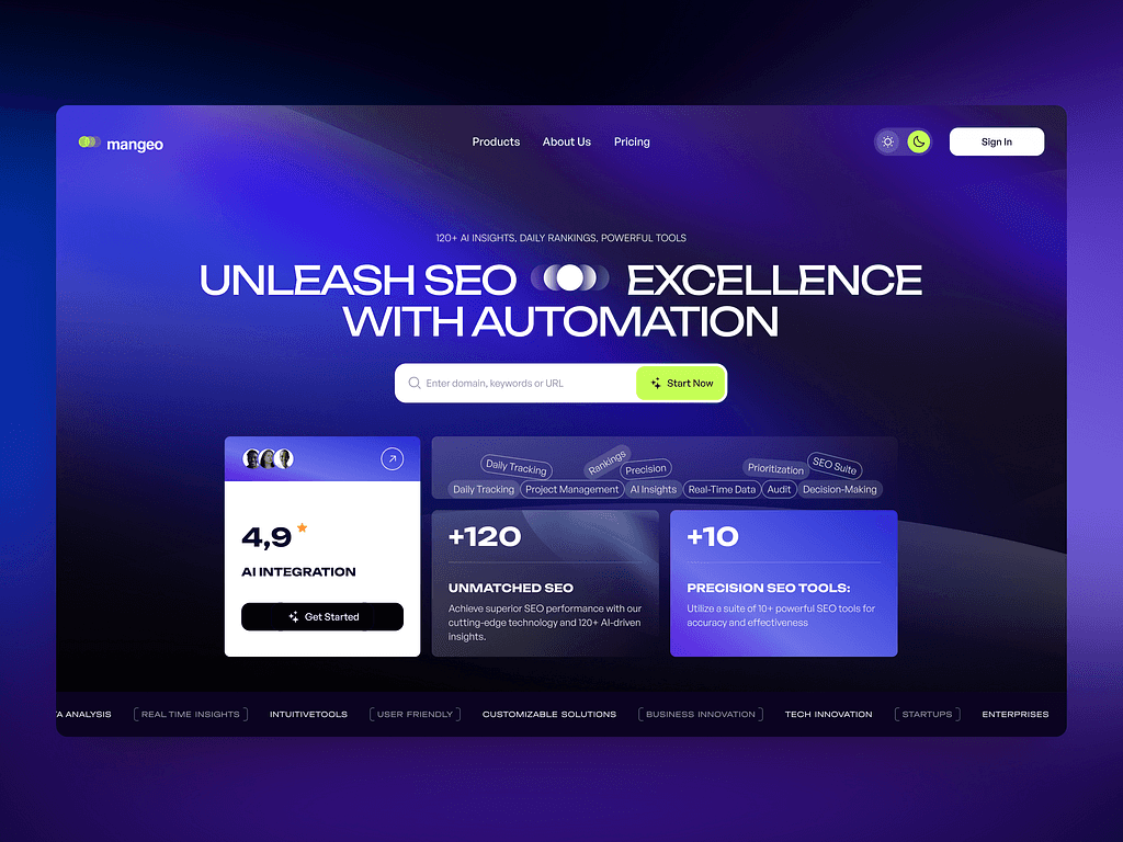
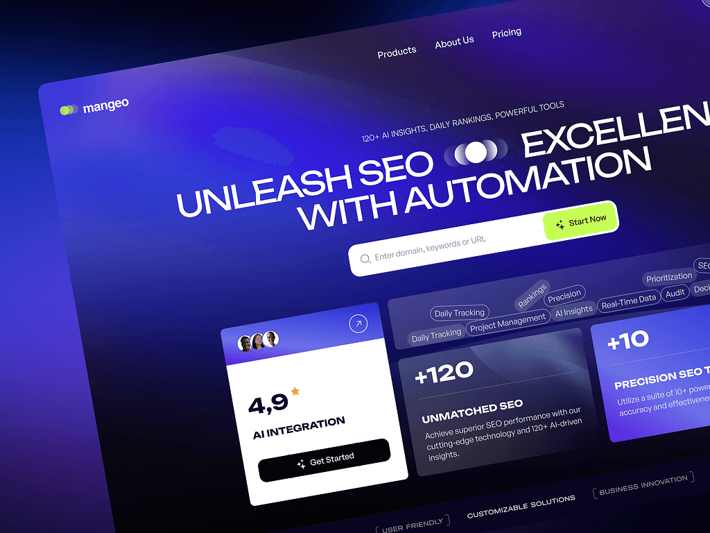
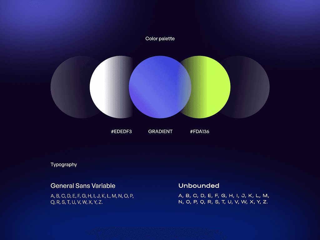
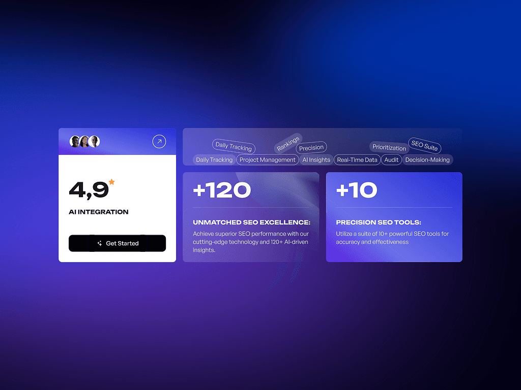
Collaborating with the Marketing and Product teams, I helped redesign and develop Sorted’s website across multiple platforms, including Umbraco, Gatsby.js, WordPress, HubSpot, and Framer. The focus was on creating a unified, scalable design system that delivered a consistent and accessible user experience. I implemented responsive templates, improved content hierarchy, and refined the visual language to strengthen brand consistency and meet WCAG accessibility standards.
To optimise performance and conversion, I used Google Analytics and Google Tag Manager to monitor user behaviour and inform A/B testing programmes. Technical improvements centred on lightweight, standards-compliant front-end development to boost SEO, site speed, and maintainability. Integration with HubSpot streamlined content management and lead-tracking, enabling the Marketing team to manage campaigns efficiently while preserving design integrity.
Key actions:
Designed and developed responsive templates across multiple CMS platforms
Used Google Analytics and Tag Manager to drive A/B testing and UX insights
Collaborated with an external agency to deliver the WordPress migration
Implemented a unified design system for visual and UX consistency
The Results
The redesigned Sorted website achieved significant improvements in both usability and performance, establishing a more consistent and professional digital experience across all touchpoints. The introduction of a unified design system created visual and structural cohesion, reducing maintenance overhead and enabling faster content deployment by the Marketing team. Accessibility enhancements ensured compliance with WCAG 2.1 AA standards, improving usability for a wider audience.
From a technical and performance perspective, optimised front-end code and SEO refinements led to faster load times, improved visibility, and stronger conversion metrics. The integration of HubSpot, along with ongoing analysis via Google Analytics and Tag Manager, supported a more data-driven approach to UX iteration and campaign performance. The collaboration with the external development agency proved highly effective, allowing seamless delivery of the WordPress platform and setting a strong foundation for future growth.

